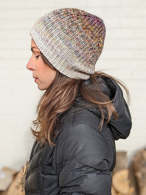
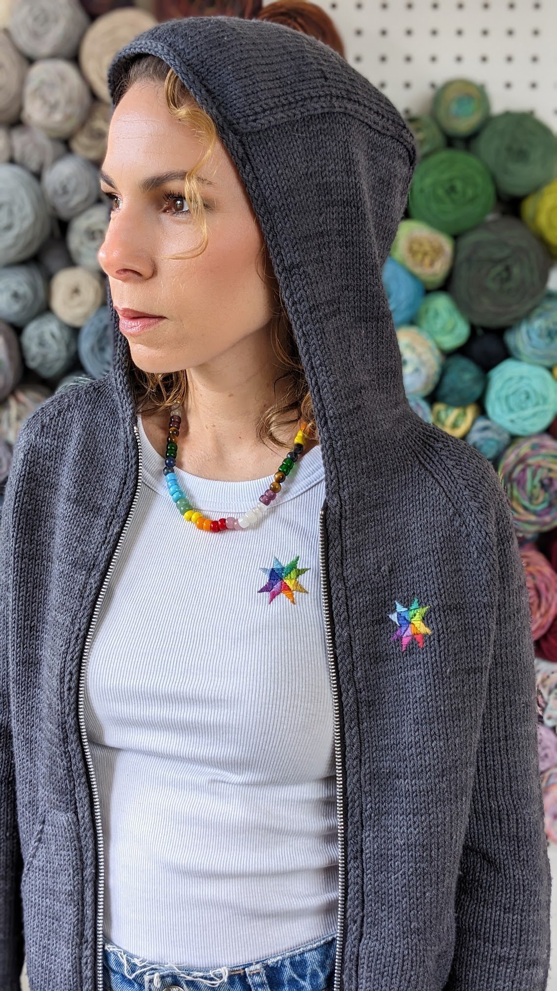
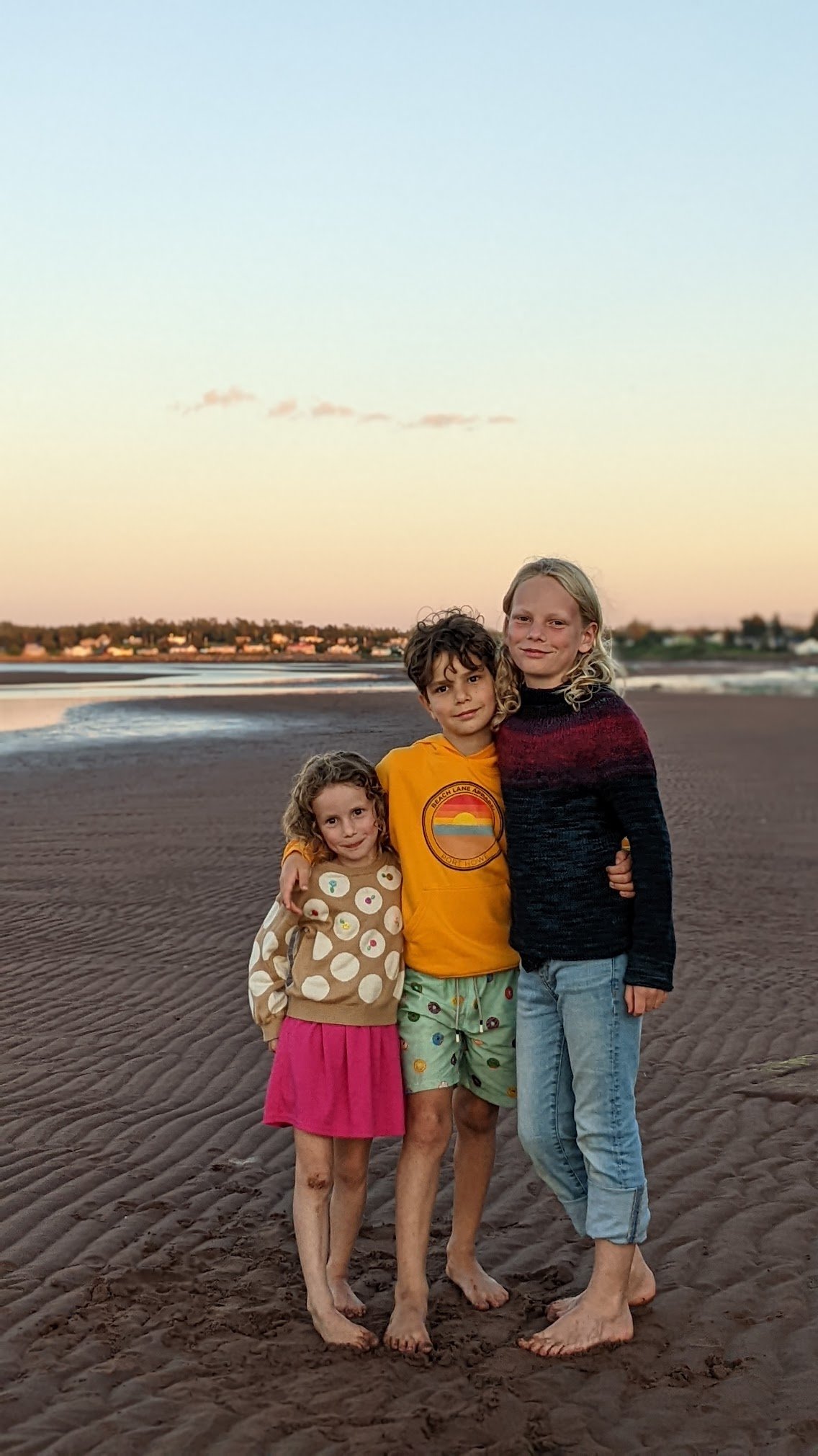
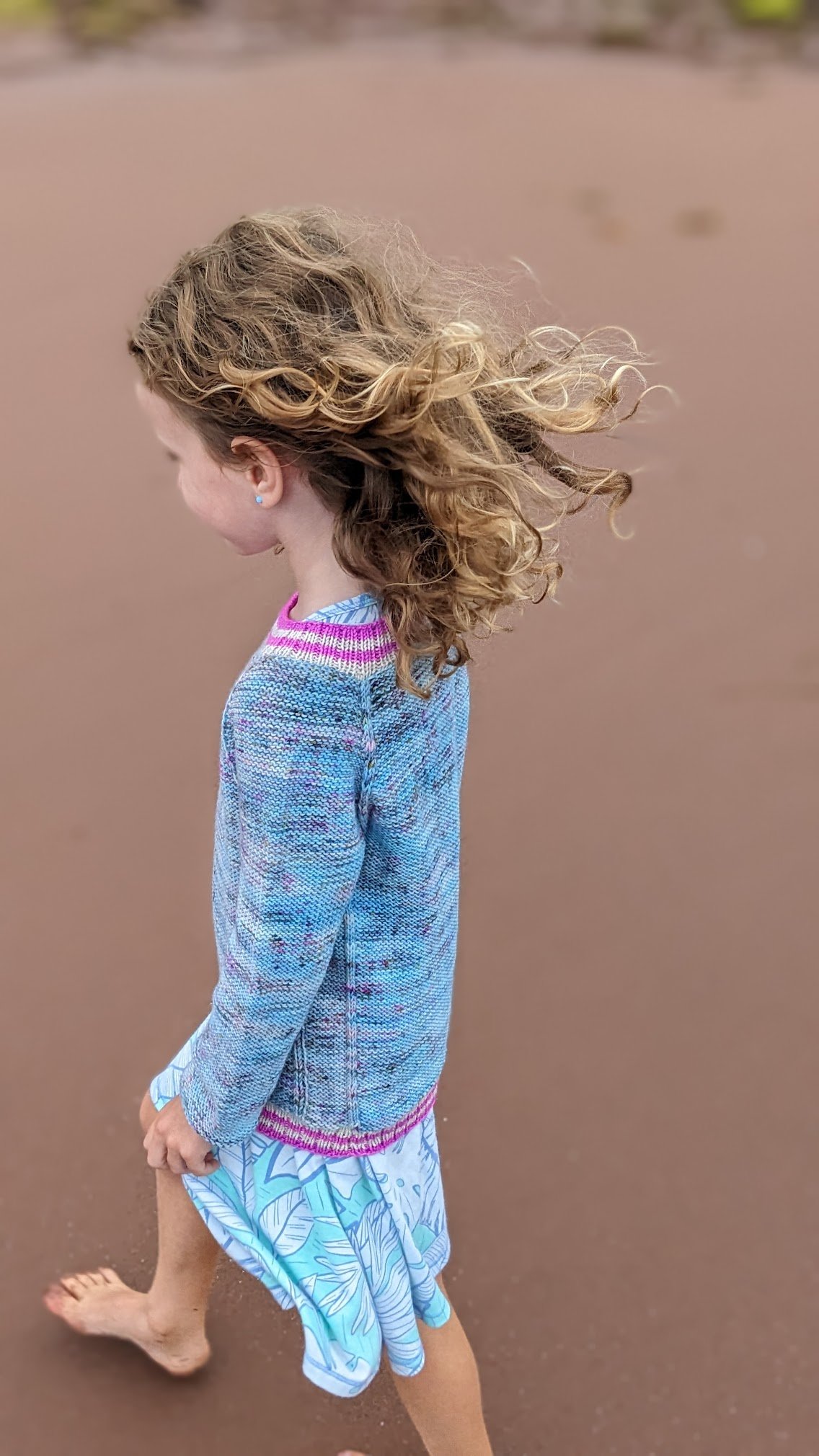
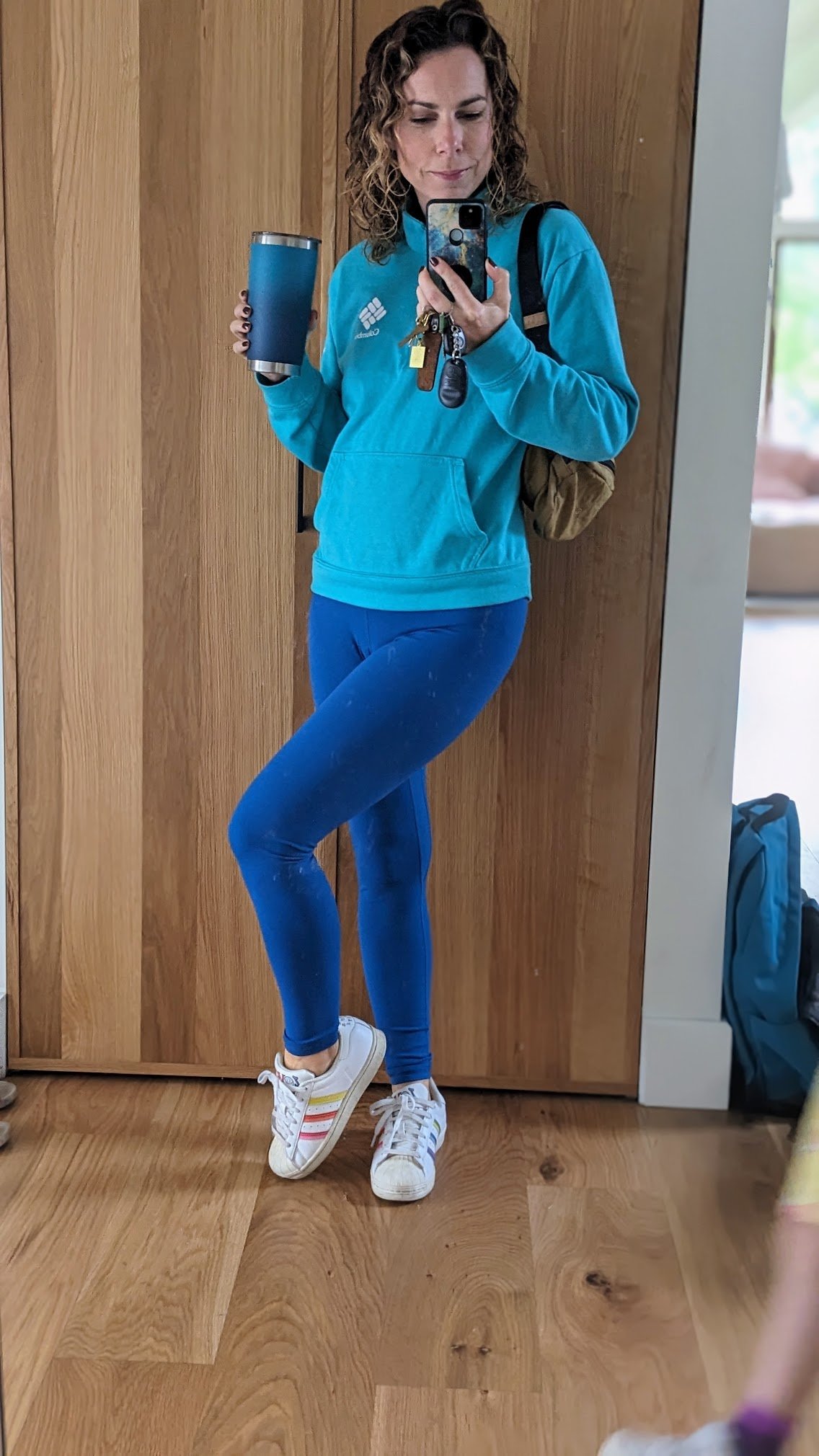
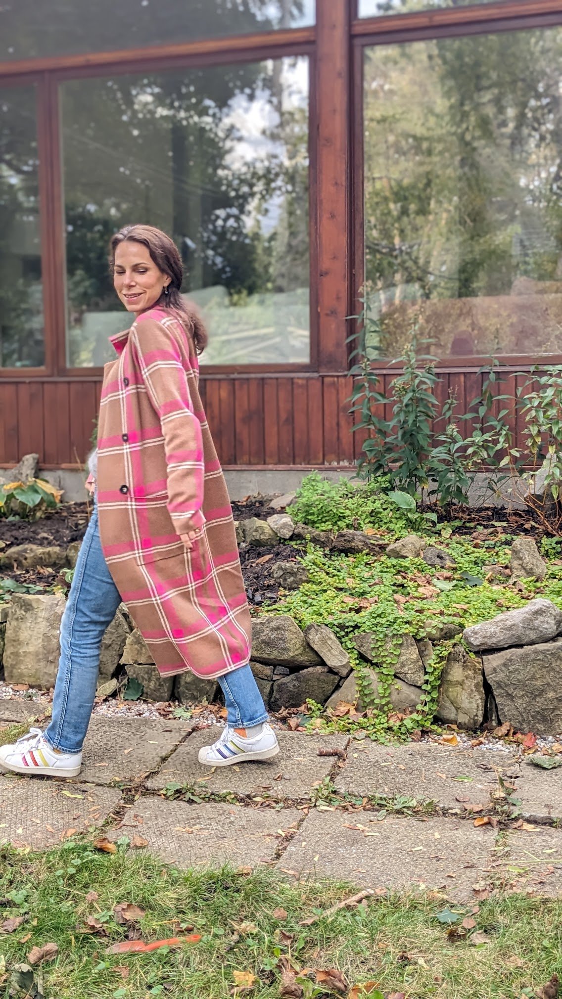
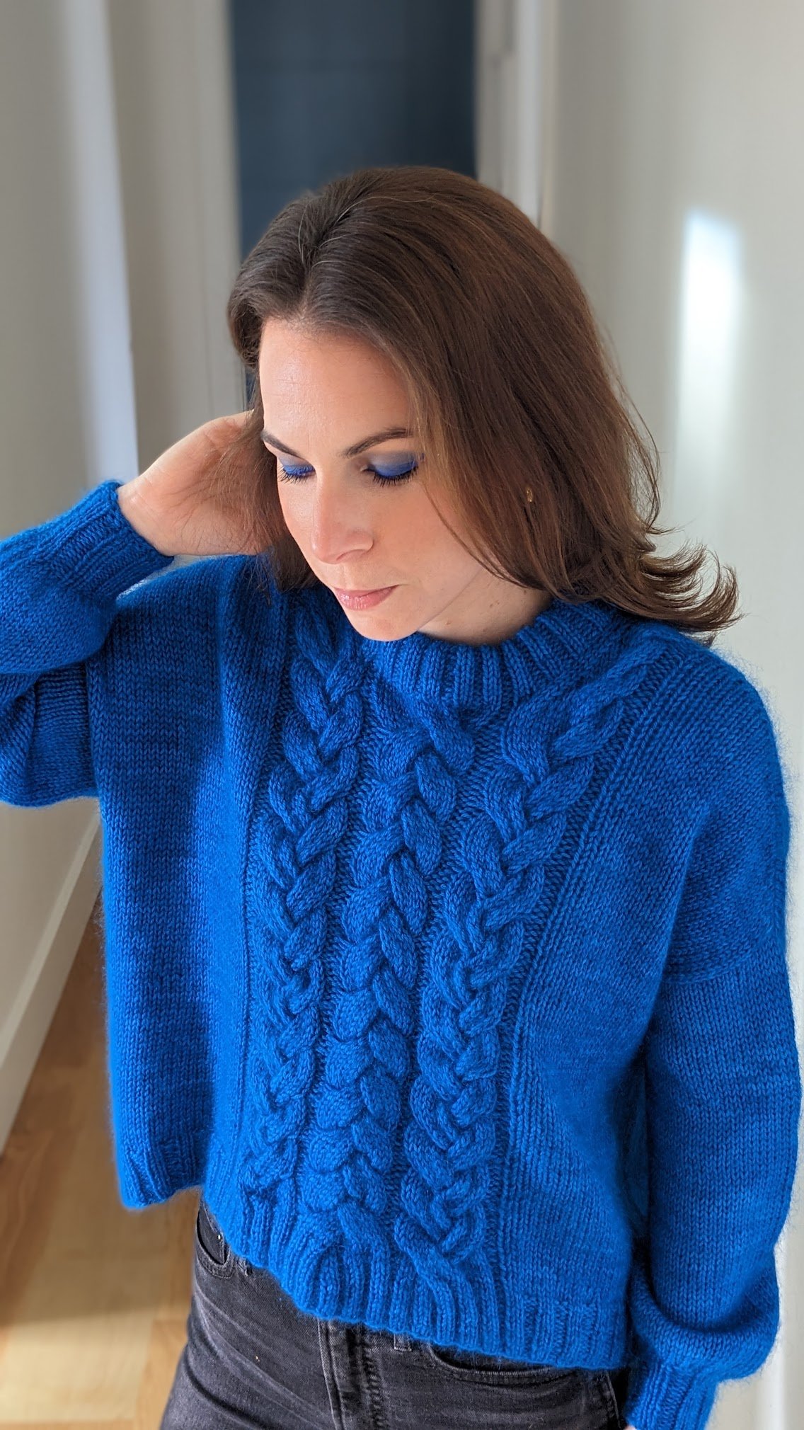
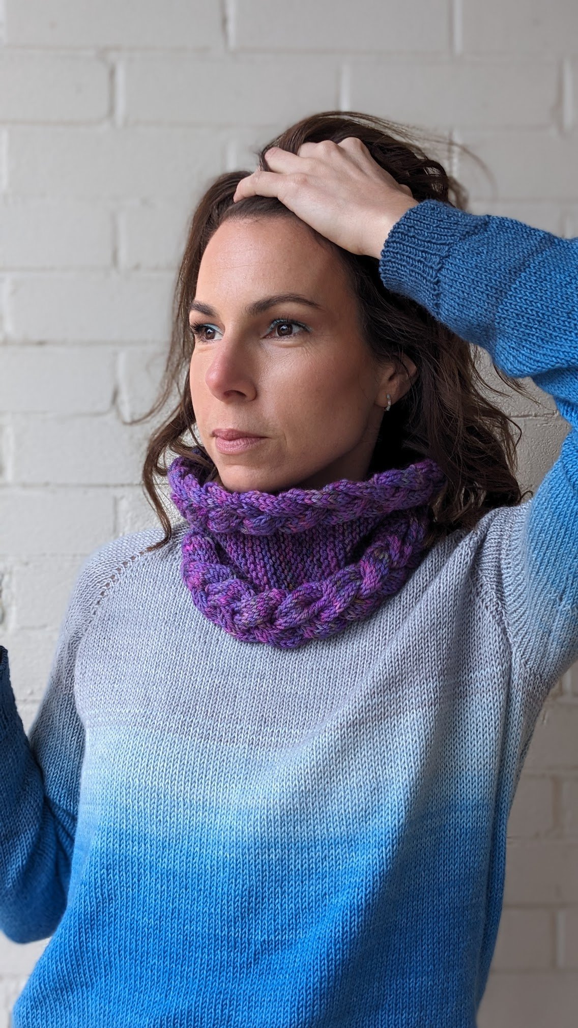
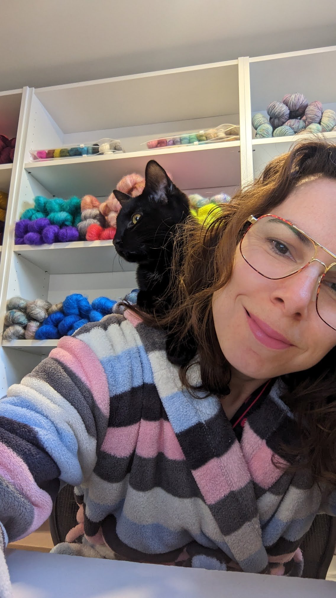
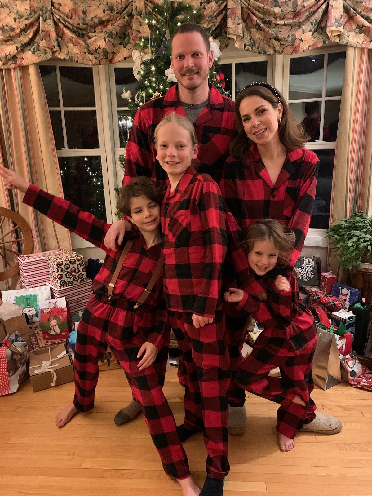
My old favourite sweater is now my new favourite sweater! This is my Cozier sweater. I knit it 2 years ago as my perfect, easy to throw on, extra cushy and cozy, high neck for the coldest days, sweater. I loved everything about it… except for the colour. With my original sample I was aiming for classic casual, an everyday staple, a neutral that went with everything. All fabulous and worthy goals for a sweater, turns out, I just don’t love wearing cream. Part of it is that I feel that it washes me out. I did THE MOST in terms of my makeup to combat this in my original pattern shots. I was even wearing false lashes! I love how the photos came out but it doesn’t acurately reflect how I look on a daily basis wearing this cream coloured sweater! I also lived in fear of spilling my soup or coffee on the sweater. I never did, and I don’t have a history of being a spiller, but somehow wearing a cream sweater brought out my spilling anxiety!
Anyway, for those reasons and also simply because I’ve always wanted to dye a sweater and I felt like I had absolutely nothing to lose I went for it. Spoiler alert, it’s the best idea I’ve ever had!
I made a how-to video for instagram reels and have posted it below if you’re interested:


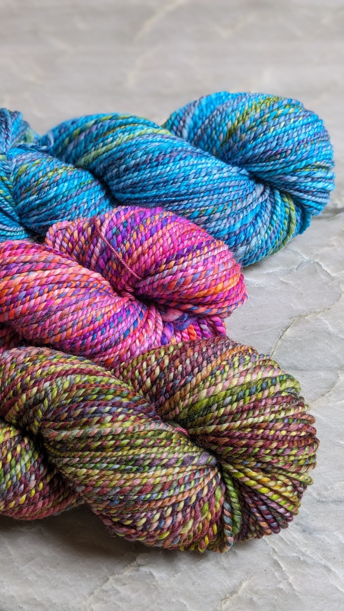
I was better at recording video then I was at taking pictures of the process, but it was truly very simple. Keep in mind that I’m a professional dyer and have been dying yarn for close to 20 years and have a studio space and all the equipment ready and waiting for these types of projects… obviously my experience plus the space made things easier for me, but I honestly think that the same process could be done using Koolaid to achieve similar results. Fun fact - I dyed my very first skeins of yarn with Koolaid. It was truly the gateway for me! We use professional acid dyes - when dyeing wool make sure that you’re using a dye that specifies that it works for protein fibers. Acid dyes require heat and acid to set, acid can be citric acid or white vinegar.
I wanted to dye only the yoke, leaving the bottom cream, giving it almost a dip dyed affect - note to self, do this again as an actual dip dye… using only one colour fading into cream. It would be fabulous!
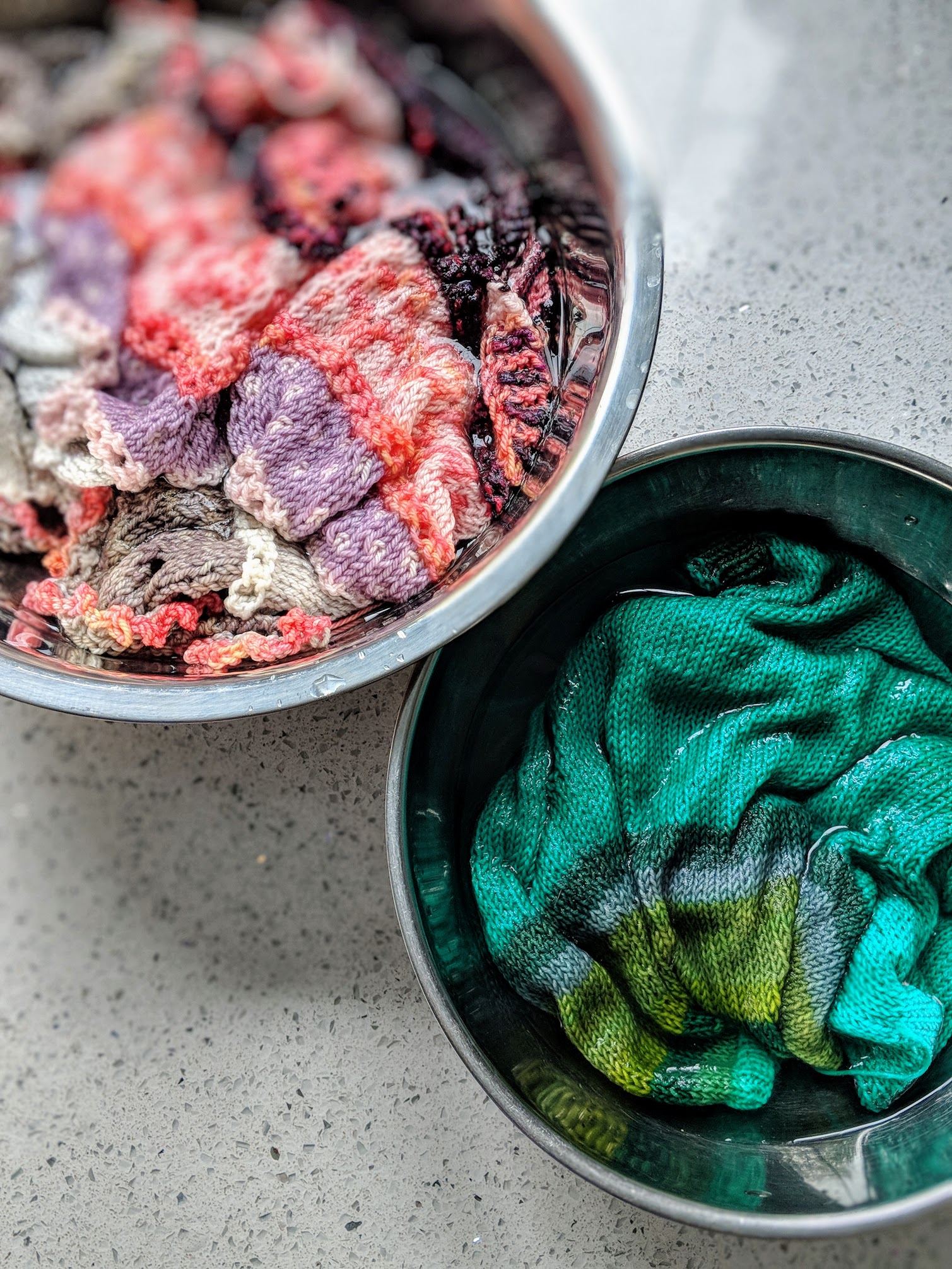
I soaked just the yoke of the sweater - literally just took a big bowl, filled it with room temp water and placed the sweater in it leaving the bottom of the sweater and sleeves draped over the sides. When the sweater yoke was sufficiently soaked I layed it out on my work surface and applied the dyes, blue, pink and yellow, in sections and used my gloved hand to smoosh the dye around a bit to control how much the colours overlapped. The magic happens in the overlap! It looked pretty garish upon application but I knew that it would settle down, blend more and become more subtle when I submerged it in water to set the dye.
So, that was the next step. Submerge the yoke in hot water with vinegar or citric acid in it to immediately set the colour. Once that was complete we decided to soften the look even more by spraying some dye on the sweater using spray bottles. It creates a soft speckled look and added a bit of grunge to the overall very cheerful sweater. After the spray we had to set the dye again using the same submerging into hot acidic water method. Then I just laid it flat to dry and waited (impatiently) to wear my new favourite sweater!
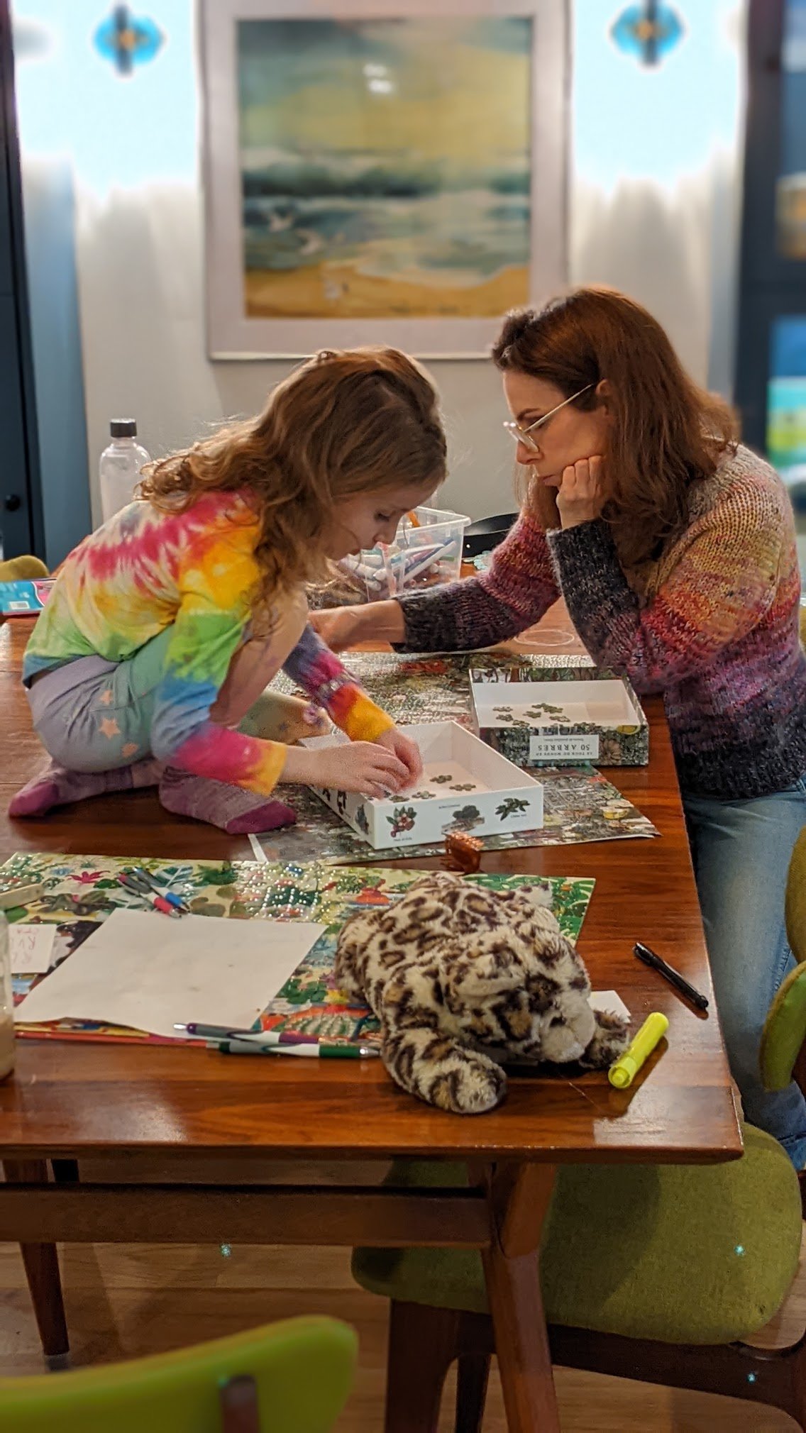
And love it I do! I think that it is infinitely more wearable for me like this. Which makes me smile because I’m a colour loving rainbow girl at heart and this sweater proves that. The success of this experiment has reminded me why I love what I do so much. For me, it’s all about playing with colour. It’s as simple as that. I know many people talk about being inspired by nature or by books or specific places, for me, it’s always been about the materials. The little spark I feel when the blue meets the pink and creates a purple… it’s invigorating. It’s what I love to do.
Here’s to more experimenting, more playing, more following your colour loving heart. And here’s to making your handmade wardrobe complete YOU!


